


Universal Modal Container Style
Style Guide: Interface
Styles: Dark
Ornament Container / Insets
Ornament Container Panels
Ornament container panels are positioned on either the leading or trailing side of the main container, with a consistent margin of 10 pixels for alignment and spacing. These panels can house either simple or organized options, depending on the app’s design requirements.
To enhance usability and visual grouping, options within the ornament container panels are assigned background tones that provide clear distinctions between groups of related elements. This approach aids users in quickly identifying and selecting relevant options, ensuring an intuitive interface.
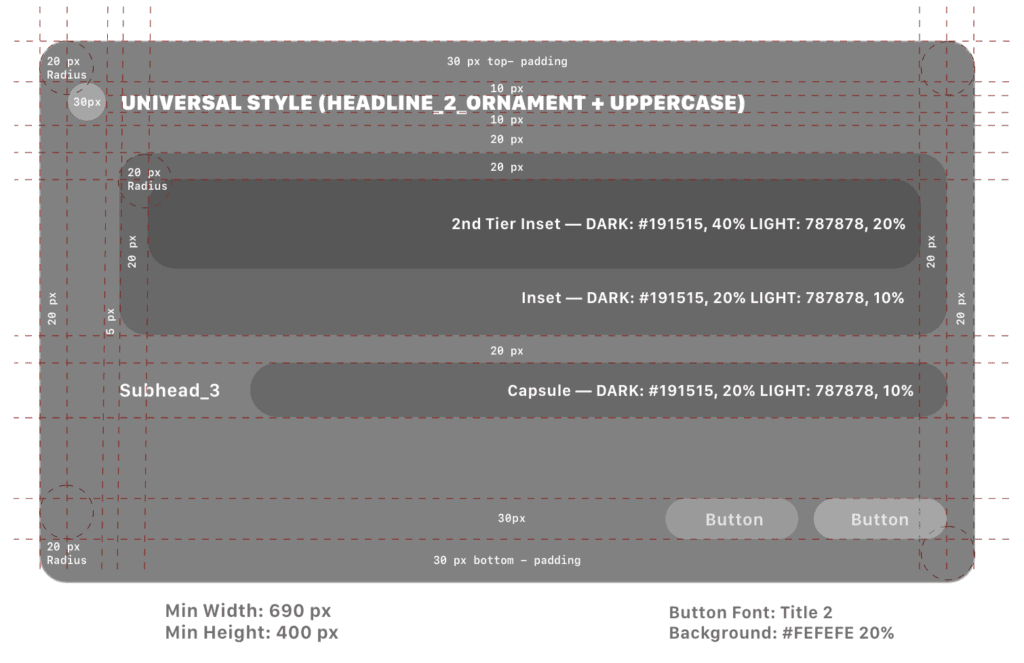
Ornament Container Additional Specifications:
Layout:
- Padding and margins: 10 pixels
- Corner Radius: 20 px
- Capsule: 30 px
- Inset — DARK: #191515, 20%
LIGHT: 787878, 10% - 2nd Tier Inset — DARK: #191515, 40%
LIGHT: 787878, 20% - Organized options: Use a grid or list layout with a minimum row height of 44 pixels to ensure touch-friendly design.
Visual Examples
Icon View Default/Hover/Expanded


Leading Navigation Default and Hover

Trailing Navigation Hover

Chart Gallery

Info Ornament

Info Ornament
More states currently being defined
- Grouped sub-panels
- Pulldown menus
- Chart Gallery
- Click Selectors (+/-)
- Date Picker
- Toggled sliders
- Chart minis
- Text input
- Overlayed Panels (e.g., Save as)
Non-Grouped Options:
- Icon: 30 px
- Ornament Padding: 10 px
- Corner Radius: 20 px
- Icon size: 30 px
- Headline Control Pill height: 50 px
- Headline: Headline_Control+Uppercase
Sub-panel Grouped
- Background #707070
- 70% stacked layer opacity
- Section Head: Headline_2_Ornament
- Options: Subhead_3

